A little Game (3)
In the last posts we created our 15-puzzle, took care that it is solvable, made it persistent and added a Function for restarting the game.
For todays post I promised you to make the thing responsive, so it fits nicely on the screen of a mobile phone, but also can be played on the desktop.
But maybe you want to play it:
Here’s the bck2brwsr version of the game
Responsive Web Design
Typically responsive design starts now with the smallest device in mind. With the advent of CSS3 web developers use media queries to define the basic layout for ranges of devices with similar screen size. Inside these ranges the use fluid layout techniques to adjust to the specific device size. Or they use grid frameworks like bootstrap to simplify that.
Responsive Design for DukeScript
In DukeScript we do the same with some specific requirements. On Desktop, iOS and Android the WebView components we are using are pretty capable and modern. That’s good for us so we need no (less) hacks and polyfills. But while web pages are typically scrolled vertically, Apps most of the time should fully fit on the screen. Try for example the great 2048 game on your mobile phone. In portrait mode it works ok. In landscape mode you need to scroll the playing field. For a web page that’s OK, but it’s not what you want from a game. We need to keep that in mind when designing our apps.
Media Queries
The Android/iOS version of the 2048 game solves the problem by locking it to portrait mode. So even if you rotate the iPhone the game won’t rotate. We could do that with some hacks, but actually it’s nicer to allow people to play in both modes.
CSS introduces Media queries that help us discover screen orientation:
@media screen and (orientation: landscape){
    /* some css */
}

@media screen and (orientation: portrait){
    /* some css */
}
New CSS3 units vh and vw
If we want our tiles to fit the screen, we need to size it relative to the smaller side. In landscape mode the small side is height, in portrait mode it’s the width. CSS3 introduces two new size units vh and vw. That stands for Viewport Height and Viewport width respectively. A value of 100vw is the full width, and 50 vh is half the height, you get the idea…
So we can size our tiles so they fit the screen and leave some space around them:
.tile{
    position: absolute;
    vertical-align: middle;
    text-align: center;
    color: #2B1B33;
    -webkit-transition: all 0.5s ease-out;
    border-radius: 5px;
    background:#93BEA0;
}

@media screen and (orientation: landscape){
    .tile{
        line-height:15vh;
        height: 15vh;
        width: 15vh;
        font-size: 11vh;
    }
}

@media screen and (orientation: portrait){
    .tile{
        height: 15vw;
        width: 15vw;
        font-size: 11vw;
        line-height:15vw;
    }
}
We use the new units for height, width and font size. Setting the line-height is needed to vertically center the text. Now we’ve got something like this:

We can also use the same units for positioning the tiles:
@media screen and (orientation: landscape){
    .tile{
        line-height:15vh;
        height: 15vh;
        width: 15vh;
        font-size: 11vh;
    }

    .tile.tile-position-1-1 {
        top:1vh; left: 1vh; }
    .tile.tile-position-1-2 {
        top:1vh; left: 17vh; }
    .tile.tile-position-1-3 {
        top:1vh; left: 33vh; }
    .tile.tile-position-1-4 {
        top:1vh; left: 49vh; }
/*...*/
}

@media screen and (orientation: portrait){
    .tile{
        height: 15vw;
        width: 15vw;
        font-size: 11vw;
        line-height:15vw;
    }

    .tile.tile-position-1-1 {
        top:1vw; left: 1vw; }
    .tile.tile-position-1-2 {
        top:1vw; left: 17vw; }
    .tile.tile-position-1-3 {
        top:1vw; left: 33vw; }
    .tile.tile-position-1-4 {
        top:1vw; left: 49vw; }
/*...*/

}
So we have a responsive design now that resizes correctly and fits on any screen. Due to the absolute positioning our grid is in the left upper corner. We can fix that by adding relative positioning to the grids container, give it a size and make centering it. I’m only showing it for landscape now. For portrait it’s the same just with vw instead of vh:
#grid{
    position:relative;
    /* also some styling: */
    background: #375A62;
    border-radius: 5px;
}

@media screen and (orientation: landscape){

    #grid{
        width: 65vh;
        height: 65vh;
        margin: auto;
    }

    /*...*/
}
The value of ‘auto’ for the margin is responsible for centering the grid. We now have a square that’s 65% of the small side in either orientation. So we’ve got some space left above the grid to add some displays showing the number of moves.
    <html>
    <head>
        <title>Sort the Tiles</title>
        <meta http-equiv="Content-Type" content="text/html; charset=UTF-8">
        <link rel="stylesheet" href="css/styles.css" />
        <link rel="stylesheet" href="css/fontawesome/css/font-awesome.min.css">
    </head>
    <body id="body">

        <div id="game" >
            <div class="fa fa-refresh" id="shuffle-button" data-bind="click: shuffle" ></div>
            <div id="best" >
                <span class="display-title" >BEST</span>
                <span class="display-text" data-bind="text: best"></span>
            </div>
            <div id="moves" >
                <span class="display-title" >MOVES</span>
                <span class="display-text" data-bind="text: moves"></span>
            </div>

            <div id="grid" data-bind="foreach: tiles">
                <div class="tile" data-bind="text: p,css: 'tile-position-'+ (y()+1) +'-'+(x()+1), attr: { id: 'tile-'+ p() }, click: $parent.move"></div>
            </div>
            <div data-bind="text: 'Hooray!', visible: solved "></div>
        </div>
    </body>
</html>
You can see that I’ve added fontawesome, which provides nice resizable icons in form of a font. The ‘shuffle-button’ uses that now. With fontawesomes CSS you can simply add classes to an element (class=”fa fa-refresh”) so it displays the icon.
I’ve also added two divs for showing the moves you took to solve the puzzle and the best result so far. In the CSS I place them above the grid like this:
#shuffle-button{
    color: #375A62;
     vertical-align: middle;
    text-align: center;
}

#moves{
    text-align: center;
    background: #375A62;
    color: #E3E2AF;
    border-radius: 5px;
}

#best{
    text-align: center;
    background: #375A62;
    color: #E3E2AF;
    border-radius: 5px;
}
@media screen and (orientation: landscape){
    #shuffle-button{
        font-size: 8vh;
        margin-left: 16vh;
        height: 15vh;
        width: 15vh;
        line-height:15vw;
    }

    #moves{
        float:right;
        margin-right: 1vh;
        margin-top: auto;
        height: 15vh;
        width: 15vh;
    }

    #best{
        float:right;
        margin-right: 1vh;
        margin-top: auto;
        height: 15vh;
        width: 15vh;

    .display-text{
        color: #E3E2AF;
        font-size: 8vh;
    }

    .display-title{
        color: #E3E2AF;
        font-size: 4vh;
    }
    }
/*...*/
}
Sizing is again relative using vh and vw, and I use float to place the items left and right respectively.
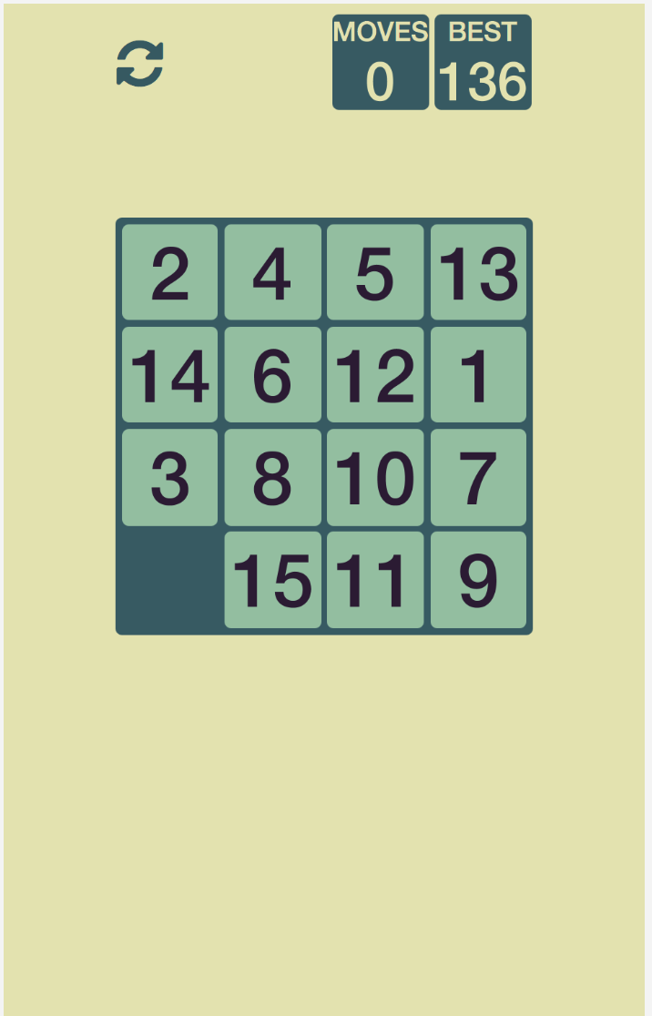
That’s it. Like this we’ve got a responsive layout that works on phones in portrait mode:
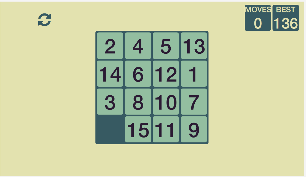
And it also works in landscape orientation:
In an ideal world our team contains a web developer who knows all the CSS tricks and takes care of this, while you, the Java developer writes the business logic. But a lot of time this is among our own responsibilities so it’s good to know at least a little bit about this domain. I recommend getting a nice book on this topic. I’ve got “Responsive Web Design with HTML5 and CSS3” by Ben Frain, which does the job pretty well.
If you want to checkout the full game it’s on github in te dukescript-demos repository:
https://github.com/dukescript/dukescript-demos/tree/master/fifteen
That’s it for this time. Next time we’ll add some sound to the game.